'How you doin?' . . . . . :D *Right!*
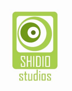
The main focus on this design of 'Shidio' is the 'O's ......why? Because~
Too many people go for the first word they see... (that's true!)
It's a design studio, everything makes sense, even when they don't!
Designers are bunch of lawyers without the law because WE MAKE THEM!!!! (almost true... we give sense to the senseless...)
I like what I see so far... (hey~ hey! I designed it didn't I?)
Cut to the real goods, It's common for people to look for the usuals for anything in life. In our case; designs, first word, main colors of the company, type face, even the histories and 'personalities' of a certain design form. In our case - 2; MONKEYS!!!~ We-oh-so loove them as a symbol of good luck and good gags~
I guess some people doesn't want to have this image of somewhat 'playfulness' or in a another word; 'not so serious' feel to a logo. It's true! In a business world, you can either stick to 'neutral' or go for one gear all the way~ And! Since it's a huge universal logo that represents all Shidio-ers, it has to be neutral all the way~ Because every one is super-talented and super-unique, monkeys might not able to do the trick...
SHI-DI-'O' as you can see, the letter 'O' is the ONE letter by itself! and if you count out the numbers of letters in Shidio shall be in..... '3...-2...-1...' BABOOM!!!~... BOOOYAAA!!!!....
Is it a count down to a DYNAMIC SOMETHIN~SOMETHIN? *I like to think so~* :D
Actually, I was thinking about 'Originality is Our Number One Priority' like a catch phrase or somethin'. It's pretty safe for me to say that most of ya'll agree with me about that. Every one wants to be the first. EVERY one wants to be original. No way around it. A sacred trust between designers, we get influences but never copy~ (But... it's business...sometimes shit happens! ..Hmm~)
It's kindoff retro and futuristic to look at~ And the colors~ was originally based on some comments from 'Sum of All Fears' and she thinks green in cool and fresh! And she's right!!! Because green is cool and fresh~ it pop out 'FRESHNESS' to the eyes and mind of the viewers~ Almost like - "Eat me!" kindoff a thing! Yeah~ SHIDIO-ers are like that, yess? Were craaazy for attentions!!~ Were 'fresh' and 'wacky', cool to boot and were The Super-RINGS to DIE FOR!!!~ ;)
FYI; the original color for the logo was 'red' but Crystal said it reminds her of kidney logo... Thank GOD WE CHANGED IT TO GREEN!!!
Well... that's pretty much it about the logo... I think~ feedbacks and craps are always welcomed!!~ My first entry for 2006~ WOOHOOO!!!!!! OOuuuwww~YEEeeaaahhhh!!!~
7 comments:
that thing kinda looks like an iPod with speakers... but it's cool ^^
wonder why no one came up with logos and the person who came back from void space created one that pwned everyone :P
for you info, Loh Poh Ben, she didn't spend her time in 'void space' doing nothing. Have you seen her vector works?!!!
anyways, it green? for real? GREEN??!! because i love green!! :)
lol... thats why lor....
actually.. i realize that.. people that don't learn stuff from TOA(photoshop & Illustrator) are better than those that learned it in TOA...
green..... nature...... ooo
LOVELY!!~ Thanks Gorgeous!!!~ ;D
Yeah~ It's almost true about the I-pod thing... I'M CRAZY ABOUT THEM!!! AND CIRCLES TOO!!!~ it's really a 'safe design'and to be frank, 'circles' speaks a universal sign of unity, infinity 'cicle of life' kind of a thing~ Hopefully, that's how our friendship or partnership should be aswell! Hey Ben?! You tak-yah nak jaga hati sayalah~ Really! I'm tougher than I looked nowadays~ I got commented by worst sort of people before that's how I grow dude~ :) COME ON~ GIMME YOUR BEST SHOT~ YO!!! ;P
Btw~ Yeah!!! GO GREEN! GO NATURE FRESHNESS~ :D
kinda reminds me of parkson's logo though
First thing I thought was.AAAAh swirling vortex. then on a closer look...ooh Chameleon's eye.I think there's something to explore there,chameleon's eye..chameleon= changing and adapting through colors (very designer-like) the EYE,the way we see things. and you know the freakish yet interesting way the chameleon eye moves..Up down,left, roll, 98 degrees, and looks like camera zoom lenses.. so the tagline can be something like (Shidio. creative things,make us work.) double meaning- 1-we are creative things,so hire us and 2- creative things motivate us to work. anyway these are just some ideas,feel free to add on or watever
Post a Comment