UPDATED : This is after reading some of the comments, which consist of only both Sam(s) and Betsy Wong's comment actually...
***********
Okay, this is another dose of Shidio Chrystal...
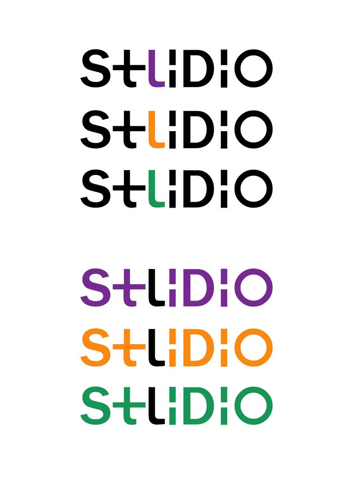
It's supposed to read 'Shidio' and 'Studio' with the same logo.. It's sort of like an ambigram (which I'm afraid to say I'm no expert in...) but I guess it's a good try for not putting any mascot in it... or bananas...
And I'm no colour expert either... purple, orange and green... yeah, that's about the colour I can think of, for Shidio... What the colour stands for...me dunno.
Now, the final part...
State your business at the comment box... *lol*
7 comments:
hehe..i read "stilido" at first...i think maybe the "h" can be more obvious...like instead of colouring only one part of the "h", we can colour the whole "h"...
i like the purple one very much..=)it'll look great on a black tag, which we'll put on our merchandises...
haha... looks like i need more improvement in logo design... it's supposed to read as Shidio AND Studio in one logo... that's why i coloured the small part of H/U but i guess it just make things worse.. haha
yeah man, i din notice the smiley face... ahahaha... sharp eye you have there, may... :p
hahahaha...ooooo....now i see it...coooool....shidio studio...it's a good job, chrys!! better than those who didn't do anything..=P like me...
hehe...the smiley face and the shocked face looks so cute!!! like blur blur wan...
chrystal try throw away the 't' tail below :)
ei the 't' dif d? the middle not longer at the right?
Looks ok. Good progress though the complexity makes it looked abit too forced no?
... I need to do something...
sighs... okay, i guess i'll come up with more different sketches...
no monkeys, bananas and ambigrams...
Post a Comment