hey guys... I was actually running through the stuffs on my super messy table when *BANG*... something hit me.
An idea hit me. LOL
So, I spent 4-5 hours doing this.
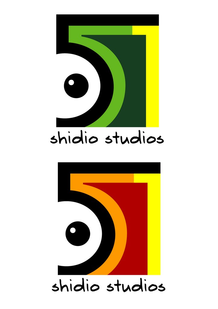
My idea is a merge of Shaza's concept and well, mine... Hope you notice the 0551 (our Shidio code number) haha...
So... What do you think?
Saturday, October 21, 2006 | Posted by Chrystal Giam at 10:26 PM
Subscribe to:
Post Comments (Atom)
4 comments:
I like the second one more cuz ur font is more fun which goes with the look and feel of the logo.
hohoho brilliant!!!
the first font is for serious type,
the second one is for crazy type... depending on what kinda person are you, you'll like your kind~
i see boob and nipple LOL BWUAHAHAA
*Eve is faaar too honest for her own good...'sweat'* :D
Anyway~
I like the first pair~ which one? I do not know~ the colors are funky, gives the feel of tropical country or island or somethin like that... (what ev...)
*my kind of a logo~ niceee~ with me as the chief and monkeys as my minions~ hohohoh~*
but somethin in my gut tells me this can still ne improved to a higher 'uber' level - like this is a brilliant start for a great logo design bebeh!!!~
SALUTE!!!! ;D
Post a Comment